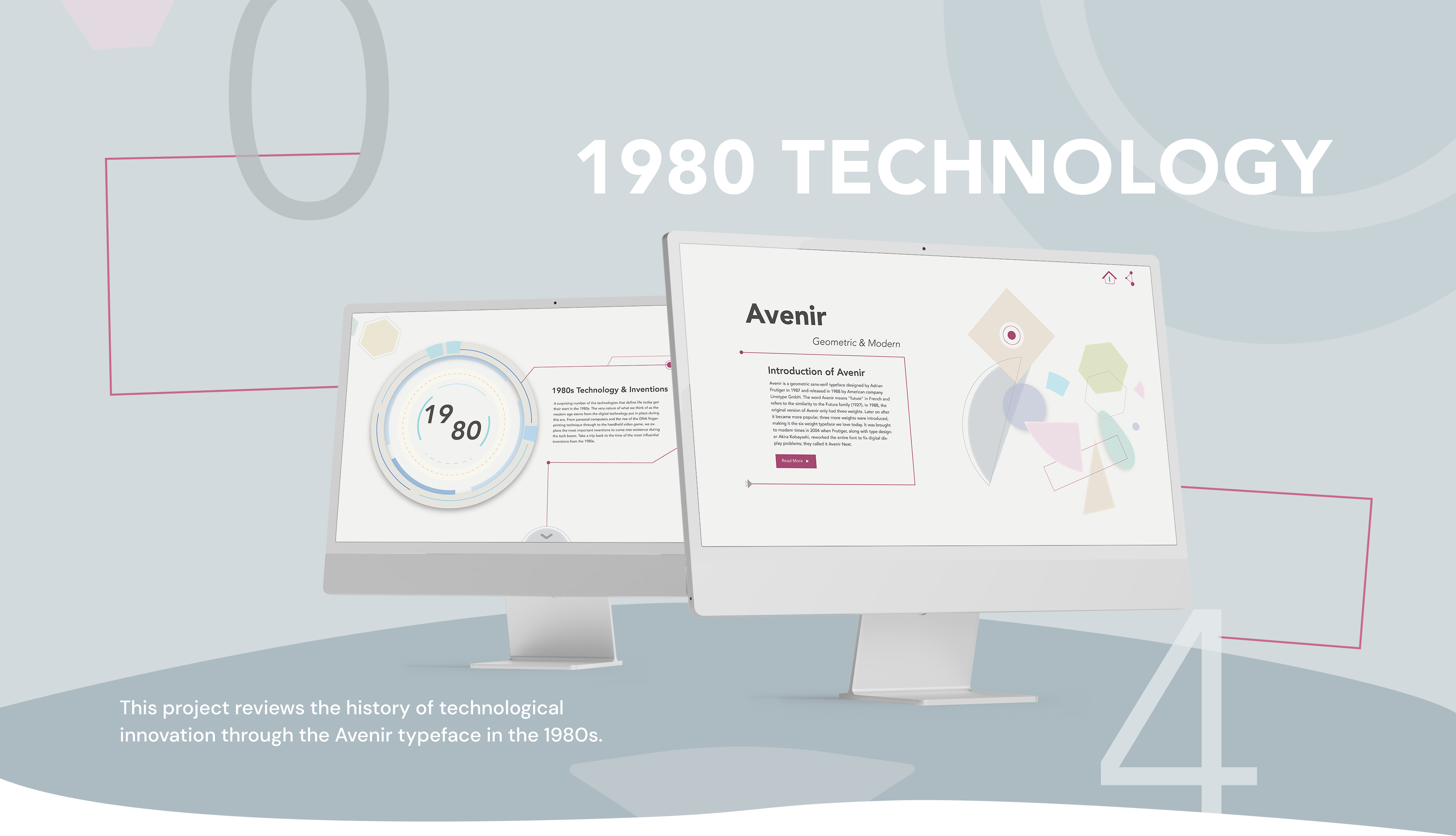
This project reviews the history of technological innovation through the Avenir typeface in the 1980s.


Background Research, Web Design, Prototype
02/2021 – 04/2021
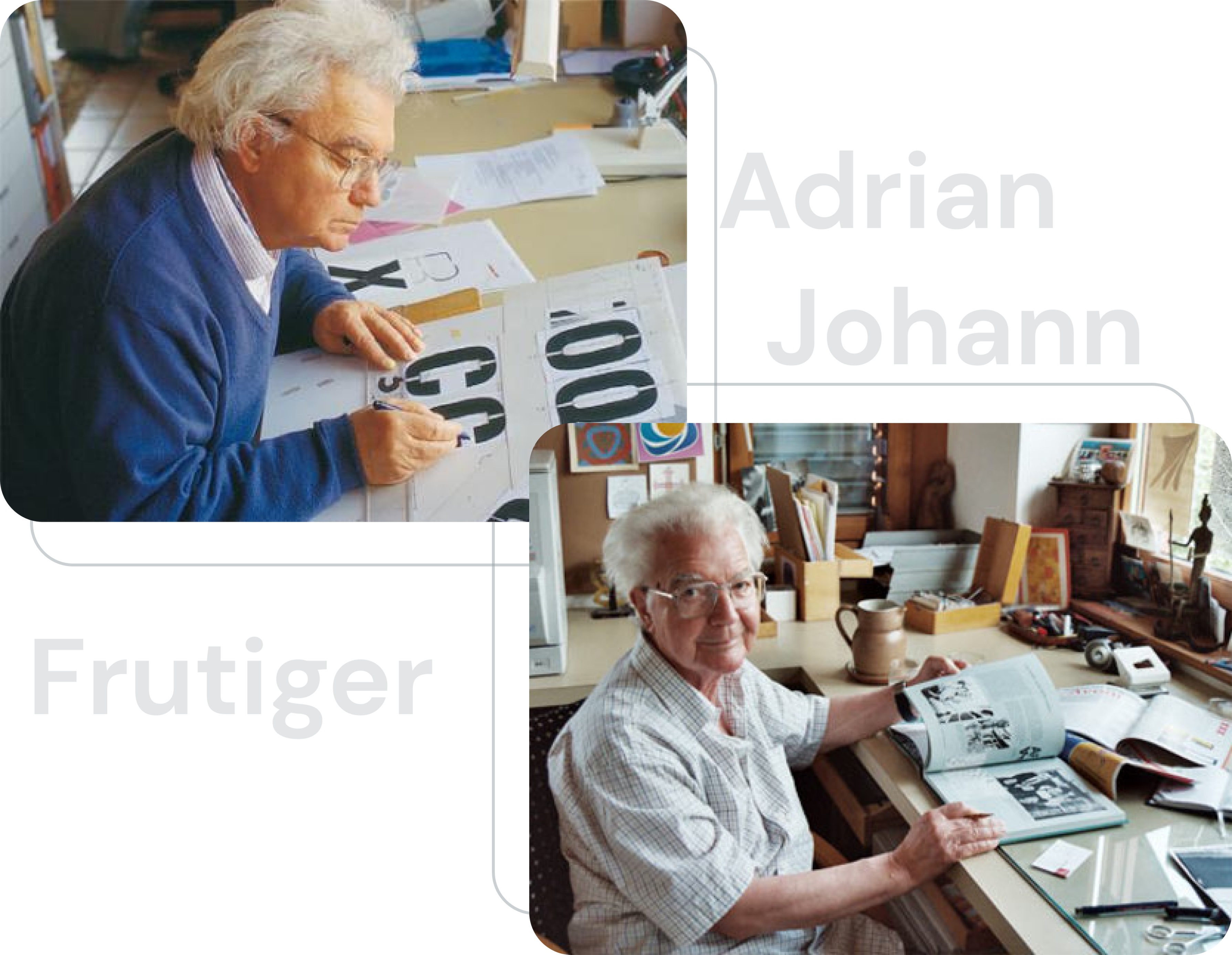
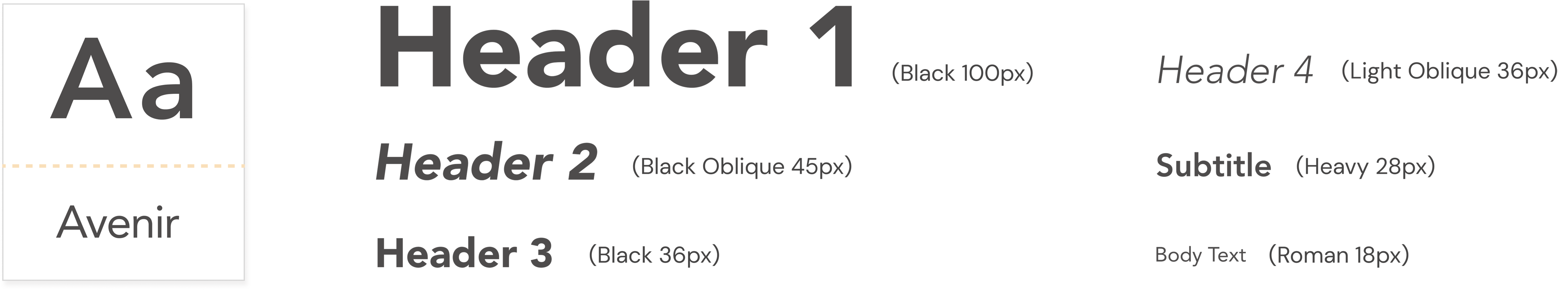
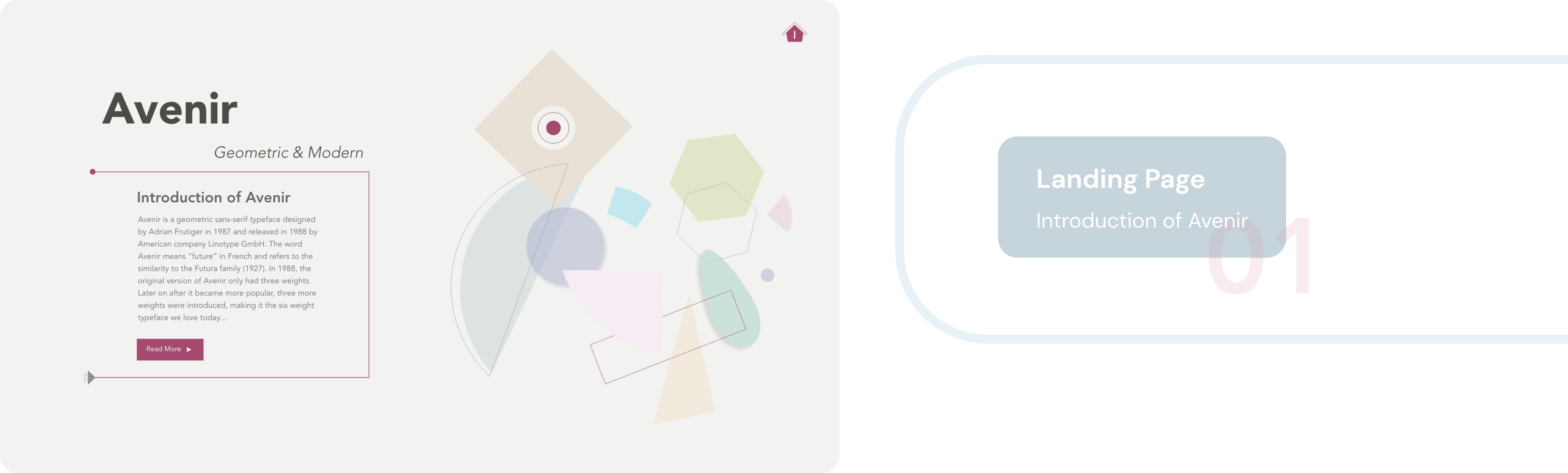
Avenir is a geometric sans-serif typeface designed by Adrian Frutiger in 1987 and released in 1988 by the American company Linotype GmbH.
The word Avenir means “future” in French and refers to the similarity to the Futura family (1927).


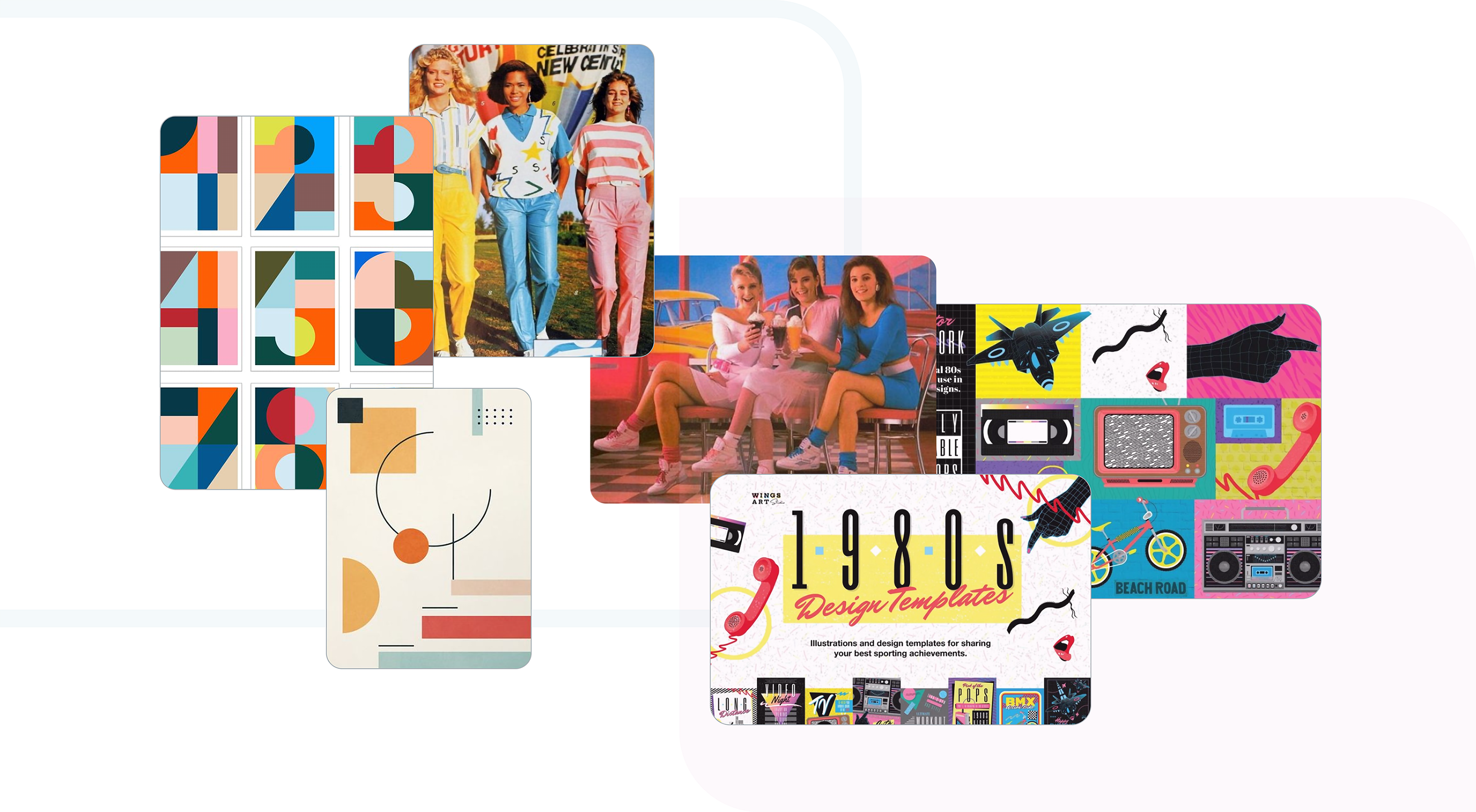
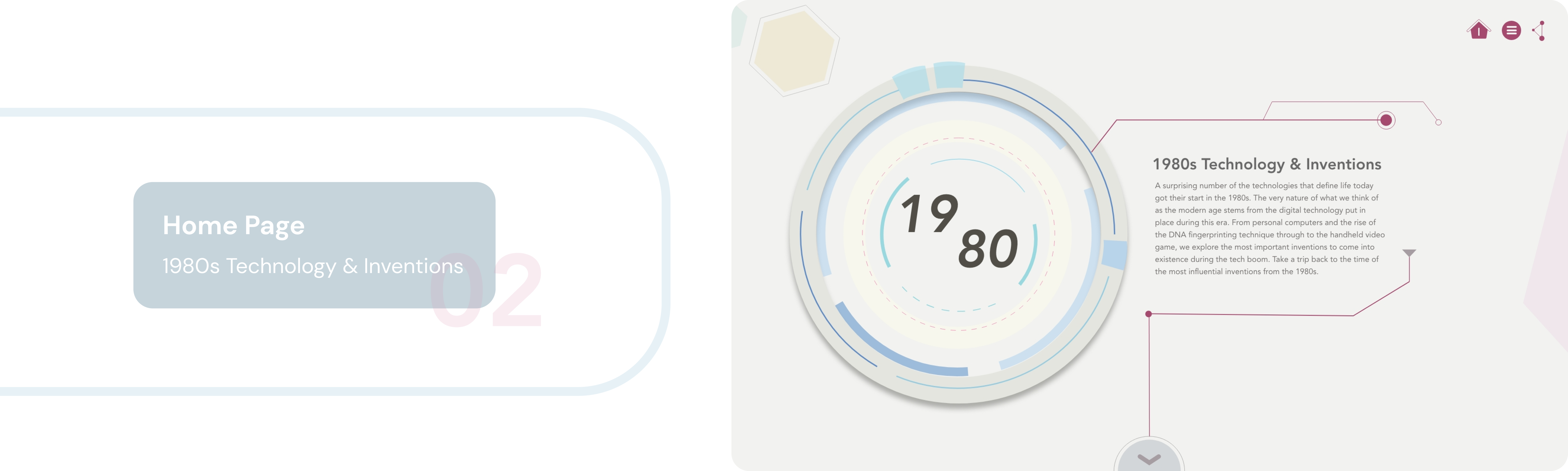
The nature of what we think of as the modern age stems from digital technology that started in the 1980s. Take a trip back to the time of the most influential inventions from this era.


The main style of the Timeline website echoes the geometric elements that characterize the typeface Avenir.
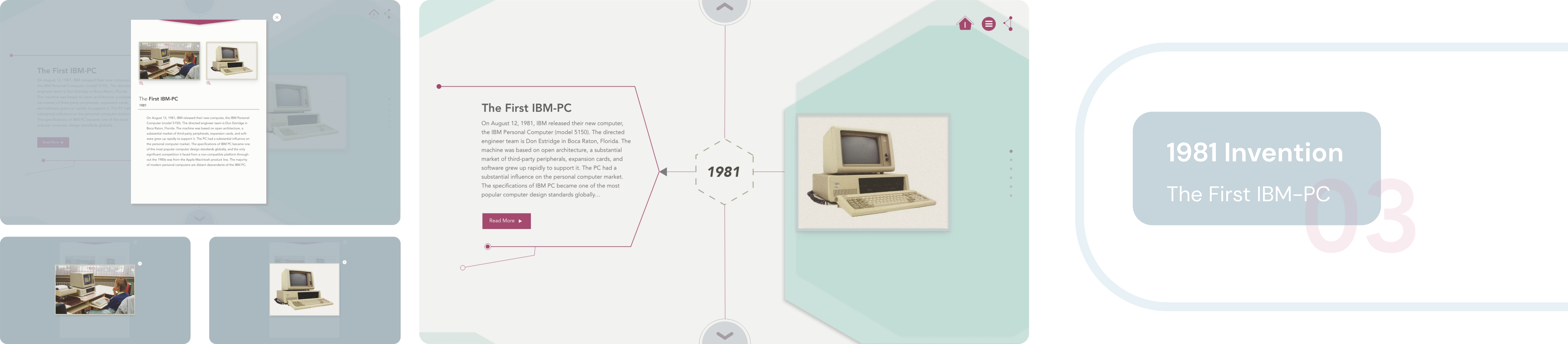
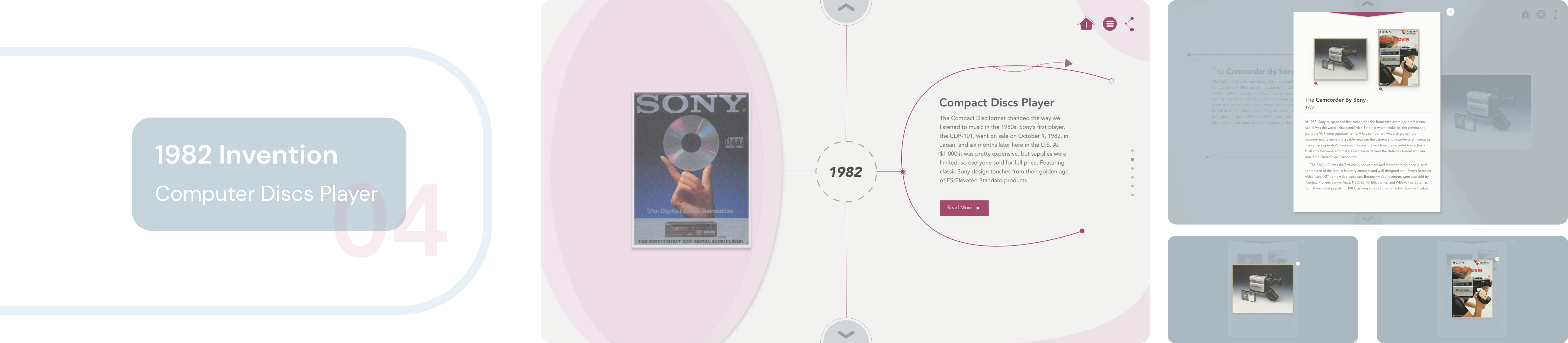
I designed various geometric patterns to highlight different eras of the invention to echo the geometric style of the typeface Avenir.
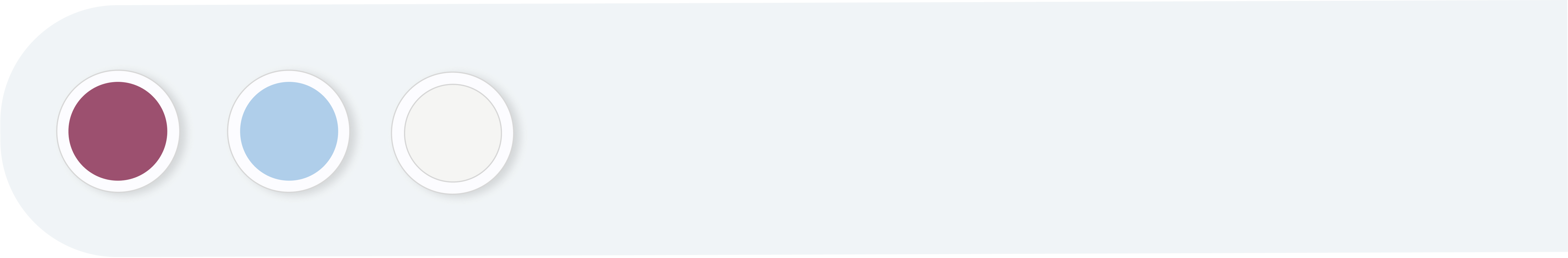
For color palette, I selected some colorful but not saturated colors in order to relate to the retro style of the 80s.


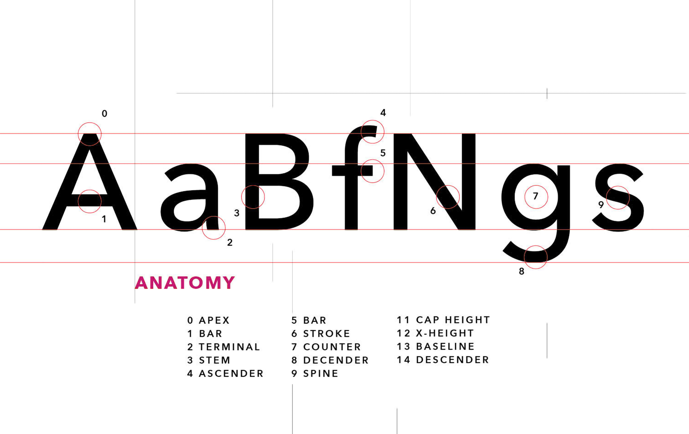
My biggest takeaway from this project was learning about the use of fonts in web design. I learned about the history of web fonts, traditional type foundries, anti-aliasing features, and standard font sizes.
I gained a deep understanding of font size variations for different screens and proportions. In addition, my awareness of font design for editorial layout, text structure, and body settings has increased.
I have developed the idea of keeping consistency and echoing context in web design. After detailed research, I decided to design various geometric patterns to highlight different eras of the invention to echo the geometric style of the typeface Avenir. I also chose a less saturated but colorful color palette to reflect the retro style of the 80s.

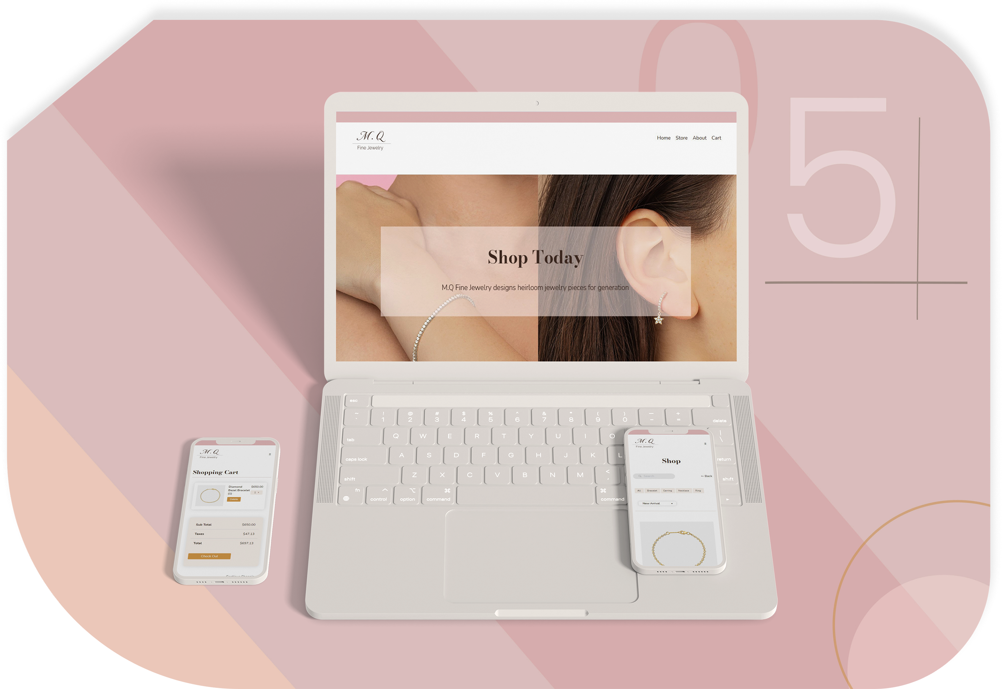
MQ Fine Jewelry is an online fine jewelry store created with web development knowledge and skills.